Scorbit is one of the most original products in the gaming space — a platform that connects pinball machines to the internet, turning every flipper and bumper into a live, social, competitive experience. Leaderboards, achievements, challenges, community feeds. The future of an analog game that never really died. When CEO Ron Richards brought me in as a freelance designer in 2021, the brief was clear: take the existing Scorbit logo and build a full visual world around it.
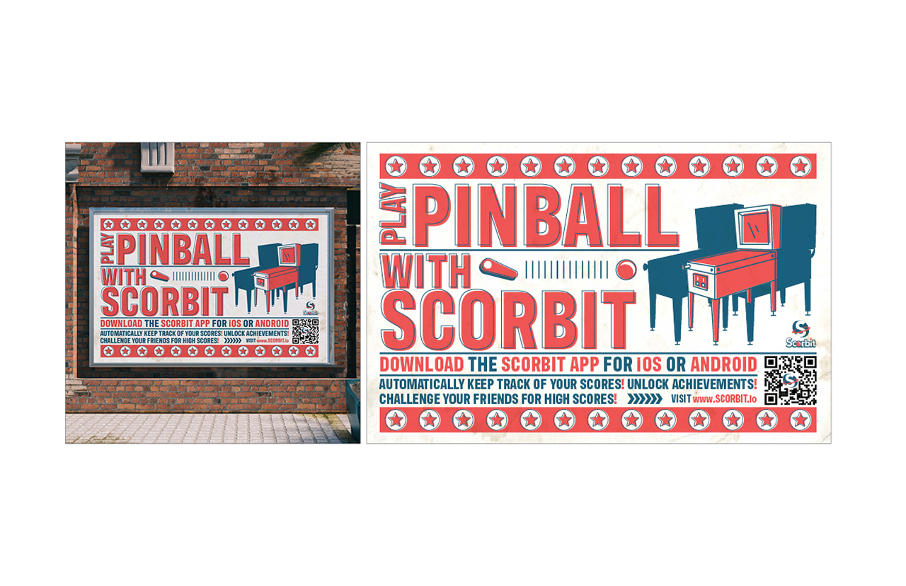
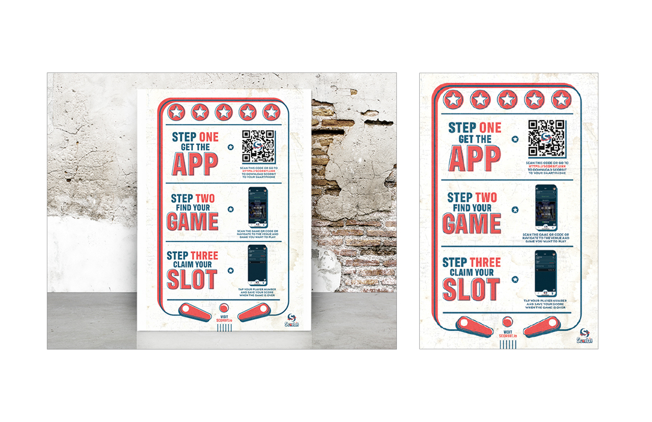
Working directly with Ron on the aesthetic direction, we leaned into the vintage arcade energy that pinball has always carried — red, white, and navy, bold type, retro illustration, the kind of graphic language you'd find on the side of a machine from the 1970s. That instinct informed everything: the UI elements inside the app, the achievement badge system, the icon redesigns, and the print and OOH collateral. The same visual thread runs from the app screen to the street poster.
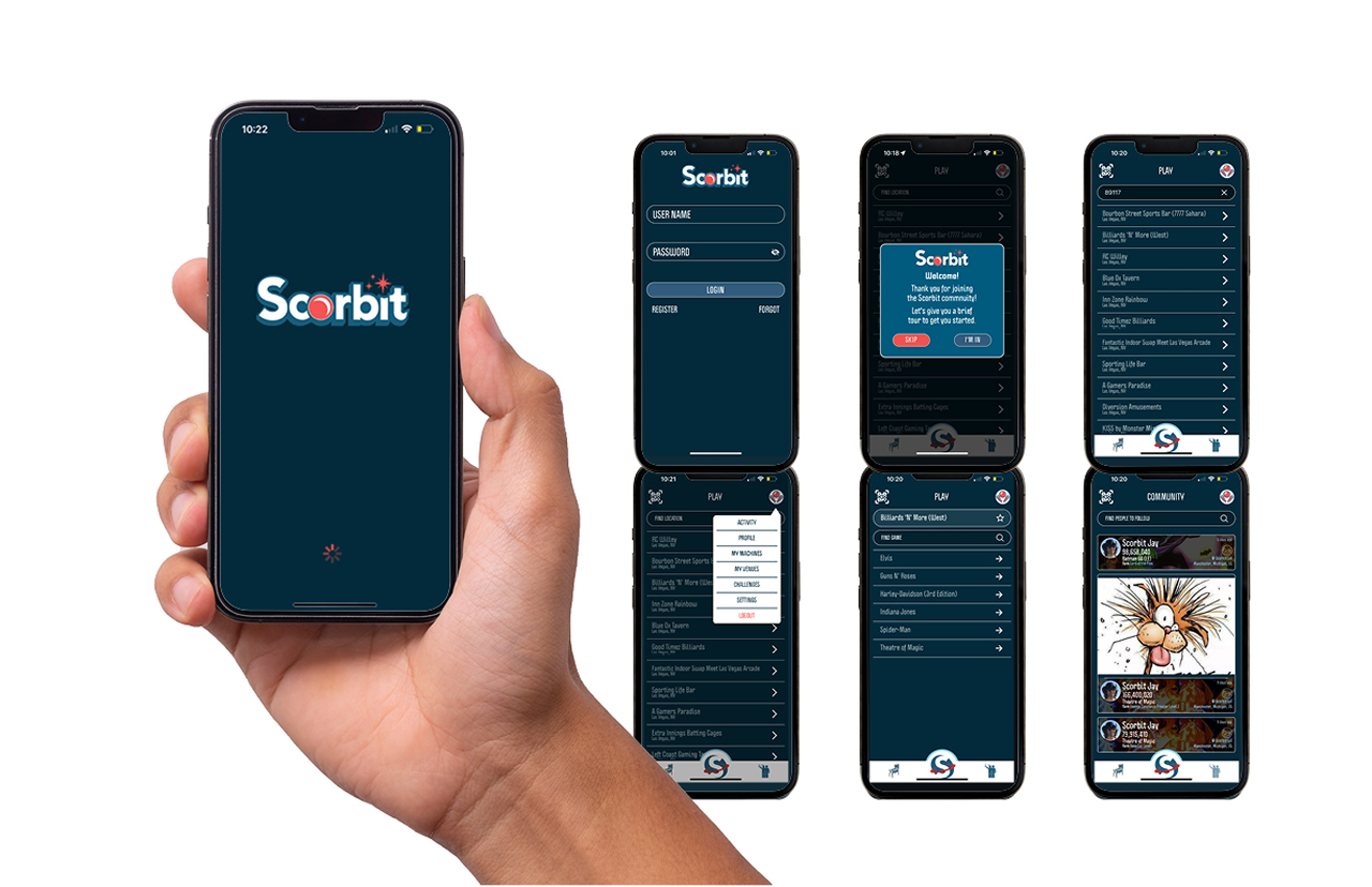
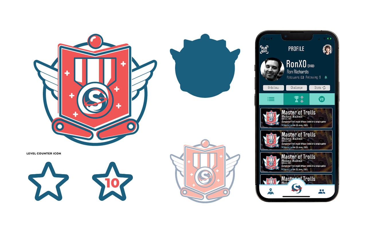
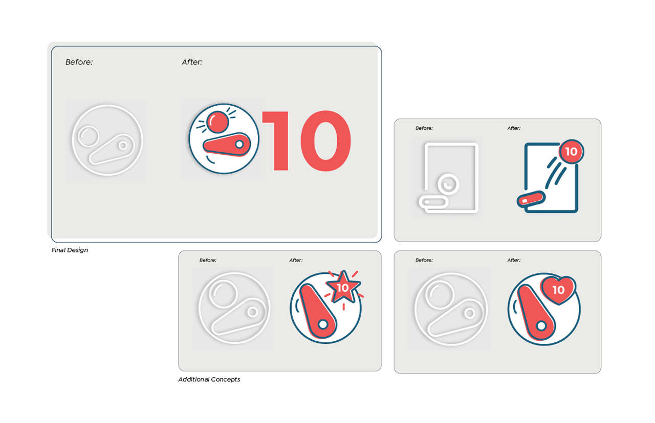
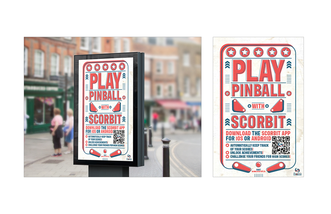
The UI work covered app screens, profile views, achievement badges — including a custom illustrated badge with multiple design directions before landing on the final — and a level counter icon redesign that took a generic placeholder and turned it into something that felt native to the brand. The print work brought the same energy outdoors: street-level posters and billboard formats built to make someone stop, look twice, and download the app.
Client:
Creative Direction:
Ul Design:
Print + OOH Design:
Year:
Scorbit
Ron Richards, Tio Lavranos
Tio Lavranos
Tio Lavranos
2021